Long-term time series analysis
This chapter explains how to extract short-term (daily/weekly) typical value from JINS MEME’s 60-second interval data and perform a long-term (monthly/yearly) time series analysis.
Notes on conducting a long-term time series analysis
Suppose there is a need to summarize indicators over a certain period of time (a day or a week) and look at the relative differences among users, or to look at long-term trends within users to see the status of users and how they have changed over time. One point to note in this case is that unless it is a very controlled experiment, the wearing time will always vary among users and days, and there will always be missing data. For example, if the number of blinks per day is simply calculated by summing the number of blinks, the accuracy will be greatly reduced because it will be directly affected by the wearing time and missing time. Therefore, the typical value should be calculated via a distribution rather than simply taking the arithmetic sum or arithmetic mean of the partitions.
Summary of Process
(1) Checking the histogram
Check which distribution is theoretically reasonable and technically easy to fit (e.g., normal distribution, gamma distribution, exponential distribution). For some indicators, it is possible to obtain a more stable plot by taking the cumulative probability distribution.
(2) Extract typical values
The method of extracting typical values differs depending on the shape of the distribution. Also, depending on the state of the data, it may be possible to extract a more stable typical value by changing the method.
- Normal distribution: When the distribution is clean, the mean is the most straightforward to obtain, but when outliers are strong, switch to the median.
- First choice: Mean
- Second choice: Median
- Gamma distribution: Mathematically, the coefficients to determine the gamma distribution are the shape parameter k and the scale parameter θ. Since the objective here is to obtain a typical value, the following measures are taken.
- First choice: nonparametric estimation of the distribution → calculation of the peak position
- Second choice: Median or lower quantile (30-40%)
- Exponential distribution: For indices with a maximum and a decreasing trend around 0, we try the following order
- First choice: Slope of the logarithmic plot
- Second choice: Quantile(90%/95%/99%)
Processing example 1… Weekly dependence of the number of head movements (horizontal)
The number of head movements (horizontal) (= neck flips) is a good measure of physical activity, such as paying attention to one’s surroundings, talking, and viewing various objects. While steps are only counted when walking, head movements can pick up small activities during sitting as well as walking. The following is a sample process for analysis in Python with the goal of obtaining typical values of this head movement and obtaining trends for each user.
Data sample
Assume a data frame (data_df) with 60-second interval data and individual IDs for each user.
Preprocessing
Since we are comparing data on a weekly basis, we assign a week number.
import pandas as pd
import numpy as np

data_df['datetime'] = pd.to_datetime(data_df.date)
data_df['week'] = data_df['datetime'].dt.isocalendar().week
data_df["user_id_short"] = data_df["user_id"].str[:5] #Simplify for display
Apply a filter that leaves only the following correctly worn conditions (wearing time is appropriate and glasses are oriented at the correct angle).
data_filtered_df = data_df.query("wea_s >= 20 & tl_yav >= -45 & tl_yav <= 90 & tl_xav >= -45 & tl_xav <= 45")
Make a histogram (1)
Since this is an exponential distribution, we compare the week-by-week distribution with a log plot.
import seaborn as sns

#log
sns.set_style("darkgrid")
sns.set_context("talk")
g = sns.displot(
    data_filtered_df, x = "hm_yo", hue = "week", palette = "dark", col="user_id_short", kind='kde', col_wrap=6
)
g.set(xlim=(0, 150))
g.set(ylim=(1e-6, 1e-3))
for axes in g.axes:
    axes.set_yscale('log')
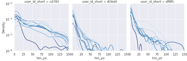
The differences are roughly shown, but it is difficult to compare them, so let’s try converting them to cumulative probability.
Make a histogram (2)
The cumulative probability can be obtained by (1) ranking each partition, (2) finding the number of partitions, and (3) dividing 1 by 2, respectively.
#Rank each partition in descending order
idx = "hm_yo"
part = "week"
tmp_df = data_filtered_df

ranked_df = tmp_df.assign(
        group_rank=tmp_df.sort_values([idx], ascending=False)
        .groupby(["user_id", part])
        .cumcount() + 1
)

#Count the number of cases per partition
group_df = tmp_df[["user_id", part, "date"]].groupby(["user_id", part]).count().reset_index().rename(columns={'date': 'count'})

#convert to cumulative probability by INNER JOINing and dividing by count
merged_df = pd.merge(ranked_df, group_df, on=["user_id", part])
merged_df["cdf"] = merged_df["group_rank"] / merged_df["count"]

#plot
sns.set_style("darkgrid")
sns.set_context("talk")

g = sns.relplot(
    data=merged_df,
    x=idx, y="cdf",
    hue=part, col="user_id_short", palette = "Blues", #dark
    kind="line" ,col_wrap=6
)
g.set(xlim=(0, 150))
g.set(ylim=(1e-3, 1))
for axes in g.axes:
    axes.set_yscale('log')
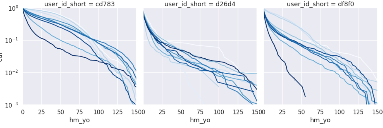
This seems to be a more stable way to do week-to-week comparisons. However, the linearity is too weak to take the typical value as a slope, so we will take it as a Quantile.
A detailed analysis of taking the cumulative probability distribution of activity and discussing the slope is reported in Hitachi Central Research Laboratory research.
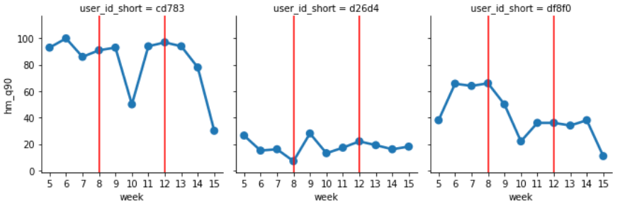
Extracting and Plotting typical Values
Extract typical values at 90% Quantile and 99% Quantile and plot the transition.
### Take a Percentile for each partition
idx = "hm_yo"
part = "week"
tmp_df = data_filtered_df

# 90% Percentile
def q90(x):
    return x.quantile(0.9)

# 99% Percentile
def q99(x):
    return x.quantile(0.99)

#Agg to typical values by week
quantile_df = tmp_df[["user_id_short", part, "hm_yo"]].groupby(["user_id_short", part], as_index=False).agg(
    hm_q90 = ('hm_yo', q90), hm_q99 = ('hm_yo', q99))

#plot
grid = sns.FacetGrid(quantile_df, col="user_id_short", col_wrap=6)
grid.map(sns.pointplot, 'week', 'hm_q90') #You should really set order , order = [0,1,2]
#In case you want to add vertical lines
for axes in grid.axes:
    axes.axvline(3, c='r')
    axes.axvline(7, c='r')
The following shows the 90% Quantile week by week, and you can see that the differences and transitions between people are taken consistently without random outbursts.
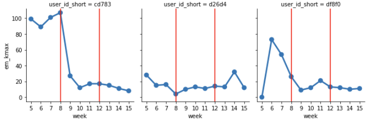
Processing example 2… Number of eye movement (horizontal) week dependent
The number of eye movements (horizontal) is strongly correlated with attention and thinking, and is a good indicator to measure mental activity. The following is a sample processing of an analysis in Python with the goal of obtaining this typical value and obtaining trends for each user.
Data sample
Assume a data frame (data_df) with 60-second interval data with an individual ID for each user.
Preprocessing
Since we will be comparing data on a weekly basis, we will assign a week number. In addition, the counts of eye movement are divided into small and large ones, so we add them.
``` import pandas as pd import pandas as pd import numpy as np
data_df[‘datetime’] = pd.to_datetime(data_df.date) data_df[‘week’] = data_df[‘datetime’].dt.isocalendar().week data_df[“user_id_short”] = data_df[“user_id”].str[:5] #Simplify for display
data_df[“em_rl”] = data_df[“ems_rl”] + data_df[“eml_rl”]
Apply a filter that leaves only the following correctly fitted conditions (wearing time is appropriate and glasses are oriented at the correct angle). You can add a filter of nis_s <= 10 to make the comparison with only less noisy data.
data_filtered_df = data_df.query(“wea_s >= 20 & tl_yav >= -45 & tl_yav <= 90 & tl_xav >= -45 & tl_xav <= 45” & “nis_s <= 10”)
### Make a histogram

Plot and compare week by week.
import seaborn as sns tmp_df = data_filtered_df
Plot only #kde sns.set_style(“darkgrid”) sns.set_context(“talk”) g = sns.displot( tmp_df, x = “em_rl”, hue = “week”, palette = “Blues”, col=”user_id_short”, kind=’kde’, col_wrap=6, ) g.set(xlim=(0, 120)) g.set(ylim=(0, 0.0003)) #If you want to add vertical lines for axes in g.axes: axes.axvline(15, c=’r’)
<img src="https://jins-meme.github.io/sdkdoc2/images/an06.png" alt="histogram" class="fig" width="100%" height="100%">

You can see that it shows a shape similar to a gamma distribution.

### Extracting and plotting typical values

The distribution function is calculated by a nonparametric method (kde: kernel estimation), the peak positions are extracted and converted to week dependence.
import scipy.stats as stats
#Take a percentile for each partition idx = “em_rl” part = “week” tmp_df = data_filtered_df
function that performs #kde and returns the point that takes the maximum value def kde_max(x): #fitting with np nparam_density = stats.gaussian_kde(x) #make x aryx = np.linspace(0, 200, 201) #make y aryy = nparam_density(aryx)
#get x by passing y largest argument to x array
return aryx[aryy.argmax()]]
#Agg to typical values by week quantile_df = tmp_df[[“user_id_short”, part, “em_rl”]].groupby([“user_id_short”, part], as_index=False).agg( em_kmax = (‘em_rl’, kde_max))
#plot grid = sns.FacetGrid(quantile_df, col=”user_id_short”, col_wrap=6) grid.map(sns.pointplot, ‘week’, ‘em_kmax’) #order should be set , order = [0,1,2] #In case you want to add vertical lines for axes in grid.axes: axes.axvline(3, c=’r’) axes.axvline(7, c=’r’) ```
The following shows the weekly peak positions, and we are now ready to discuss the differences between people and the weekly transition without any random outbursts.